
Visualizing the US-Iran Diplomatic Framework (2026)
📌 Project Brief
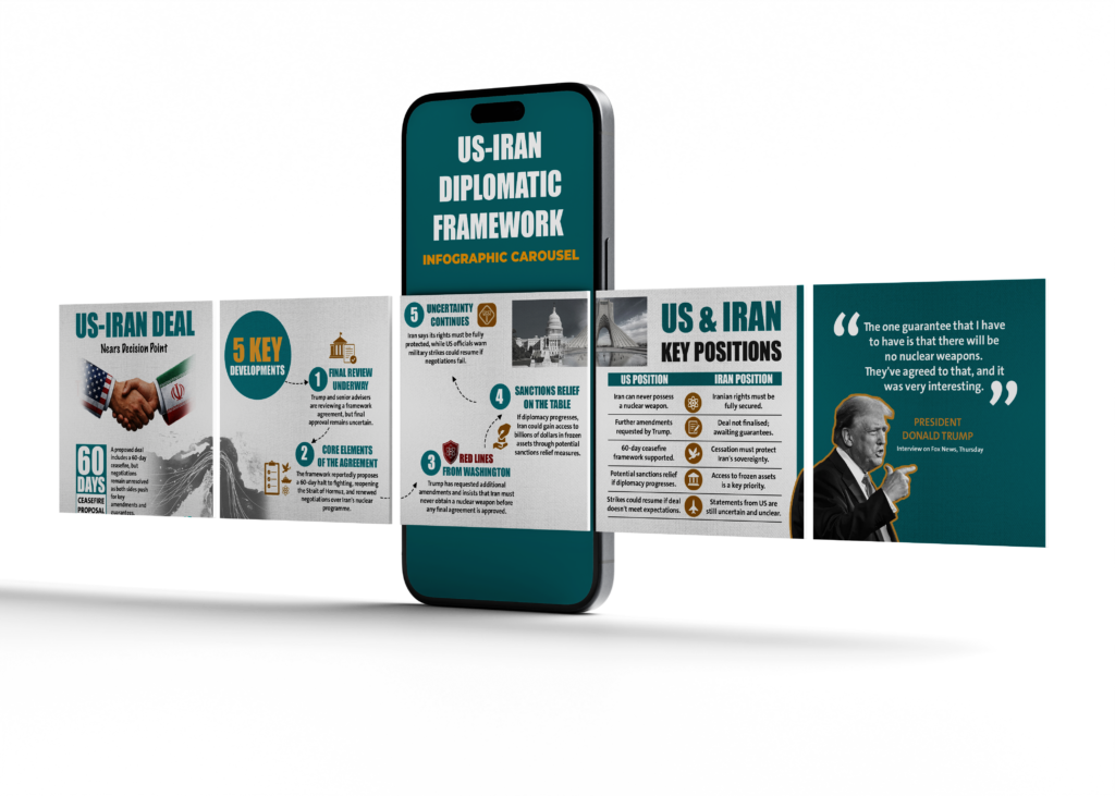
As an Information Designer, I designed a high-impact digital carousel breaking down the complex, fast-moving negotiations between the US and Iran over a proposed framework agreement. Sourcing breaking data from BBC News (dated May 31, 2026), my goal was to simplify a multi-layered international relations story into an intuitive visual summary for social media audiences.
🚨 The Challenge
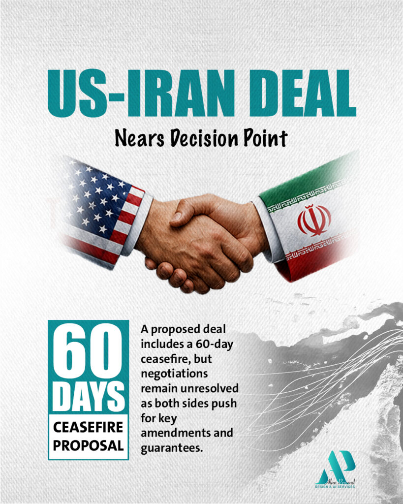
International diplomatic negotiations are dense and full of conflicting perspectives. This specific 2026 deal involves complex moving parts: a proposed 60-day ceasefire, the reopening of the Strait of Hormuz, billion-dollar asset freezes, and a high-stakes nuclear debate.
The Problem: Standard news articles present geopolitical gridlocks in long paragraphs, making it difficult for the public to compare both nations’ demands side-by-side.
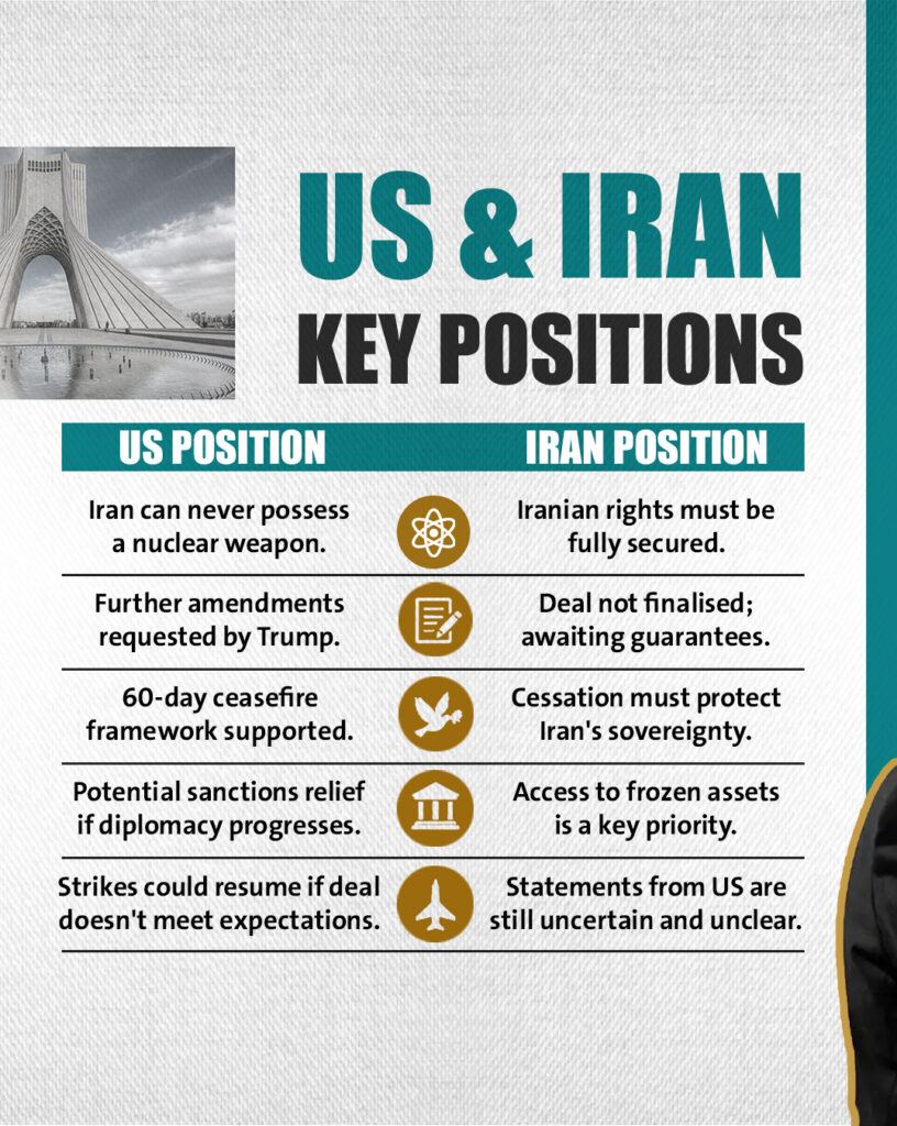
The Goal: Build a step-by-step visual narrative that clearly outlines the agreement’s core elements and highlights the specific “red lines” for both Washington and Tehran.
💡 The Strategy
o turn this breaking news report into clear data storytelling, I applied a clean, chronological information hierarchy across the carousel:
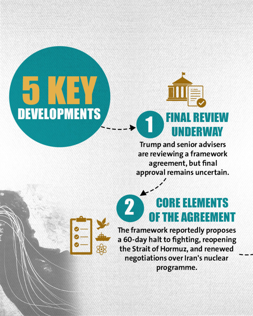
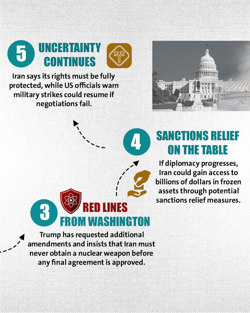
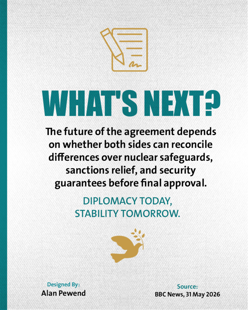
Information Chunking (5 Key Developments): I organized the text into a step-by-step path, guiding the reader from the initial framework review directly into the specific core elements like the 60-day halt to fighting.
The Comparison Matrix: I built a direct, side-by-side table mapping out the exact friction points—such as the US position on potential sanctions relief vs. Iran’s priority of accessing frozen assets.
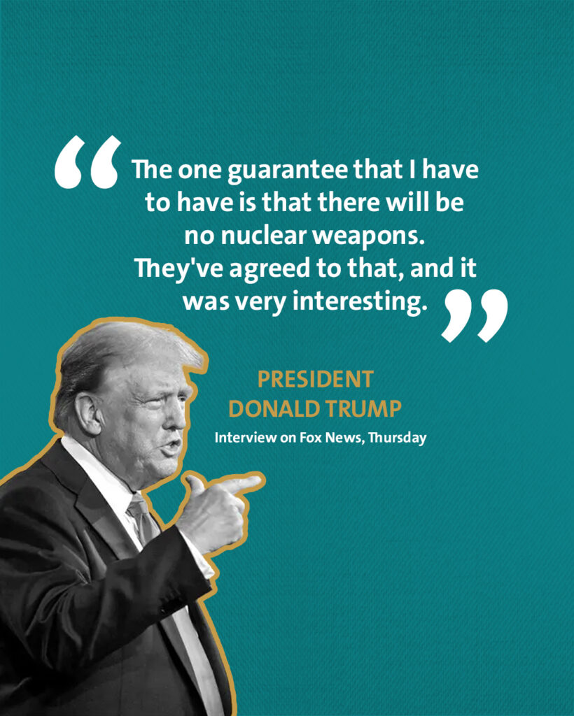
Quote Optimization: Rather than hiding key political stances in dense prose, I dedicated an entire high-contrast layout to a crucial quote from President Trump regarding nuclear guarantees, instantly anchoring the political stakes of the deal.
🎨 Design & Tools
Aesthetic: Editorial and authoritative texture, using a sharp teal and gold color palette to give the political topic a professional, trustworthy feel.
Tools: Adobe Illustrator / Adobe Photoshop / AI-assisted asset layout.
📈 The Result
The carousel successfully simplified a major geopolitical turning point into a highly readable, thumb-stopping graphic. It allowed users to immediately understand what is on the table, what comes next, and where both countries stand, while maintaining 100% journalistic accuracy.